Turbotax
The Brief:
Research showed that users experienced frustration and confusion with the needs review label that occurred after uploading a document. As the content designer on the team, I found opportunity to restructure and reframe the label to better set user expectations.
Role:
Content designer
What I did:
Content strategy
User testing
UX writing
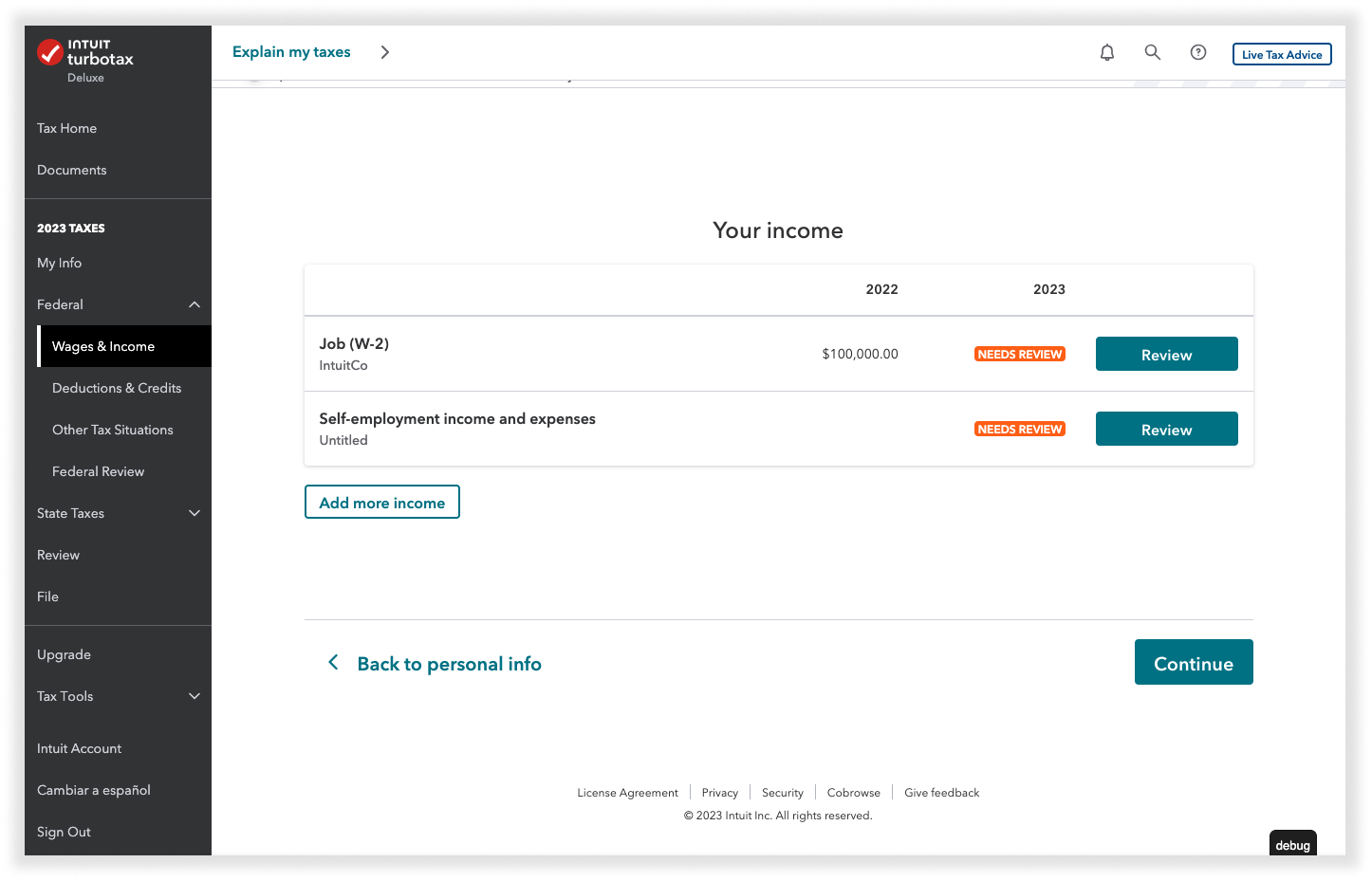
The problem:
I am a customer who uploaded documents through the Tax Hub.
I am trying to understand what happened to my uploaded docs and what to do next.
But I do not understand what “needs review” really means and what sections actually need review.
The scenarios:
A section is completely autofilled through a doc upload.
A section is partially autofilled through a doc upload.
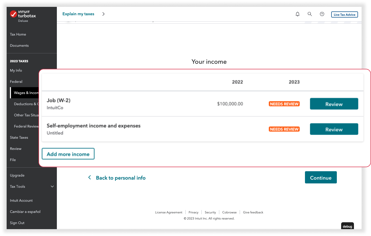
A section is partially autofilled through previous information.
Note:
Due to legal compliance, we must have users “review” the information that had been autofilled.
However, tech constraints show us that users will only be taken to the top of a section without further explanation as to what needs to be reviewed.
“Best set user expectation that their autofilled info needs to be reviewed?”
How might we:
But wait…
Users need to know what areas actually need review. It’s not just a labeling issue.
Could we…
Add another screen where they verify the imported info?
Pushback:
Highlight which areas need review?
Within the scope of this project, we were pushed back to the constraints of looking at how we can use labeling to solve this issue.
Iterations + user testing
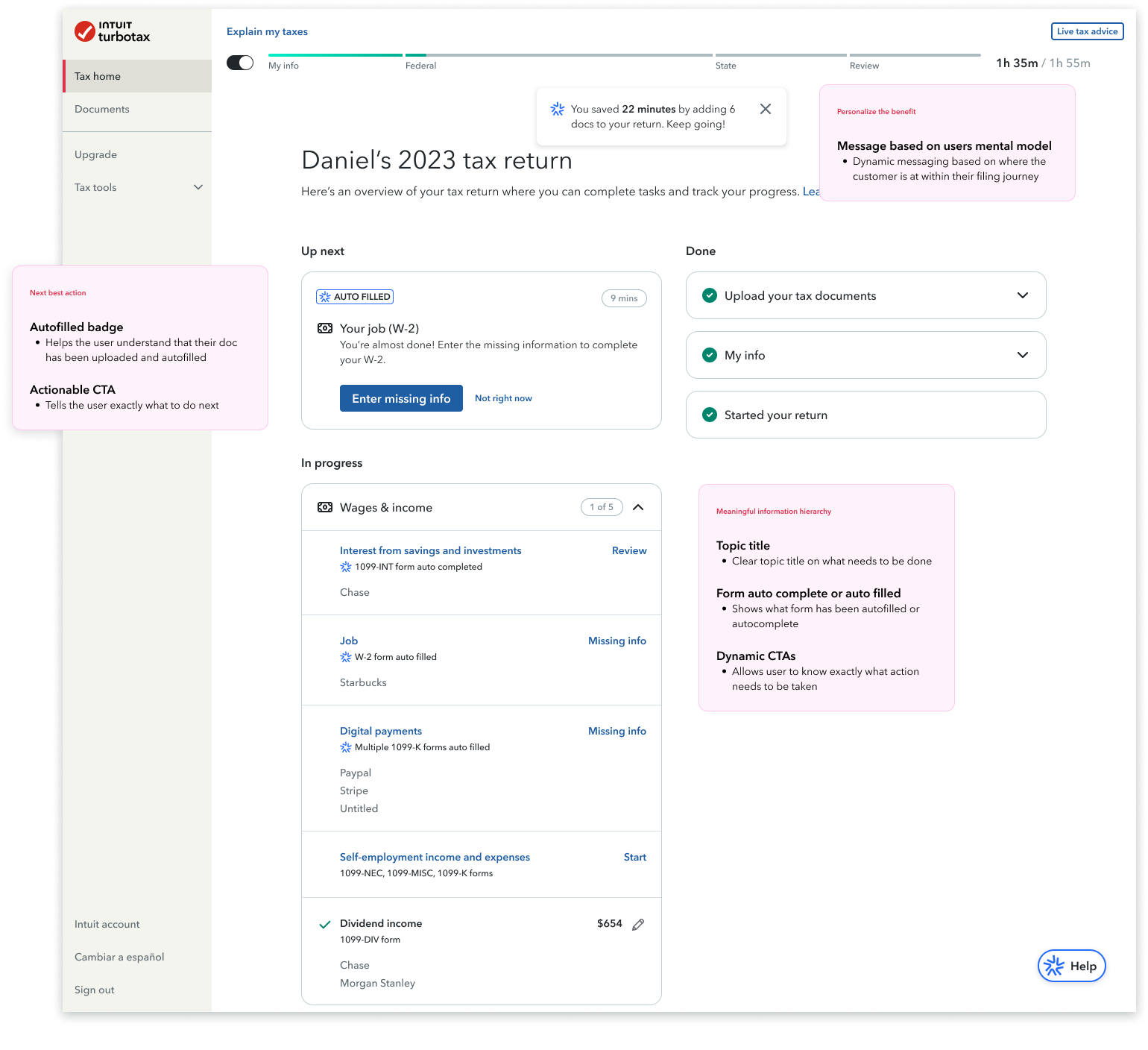
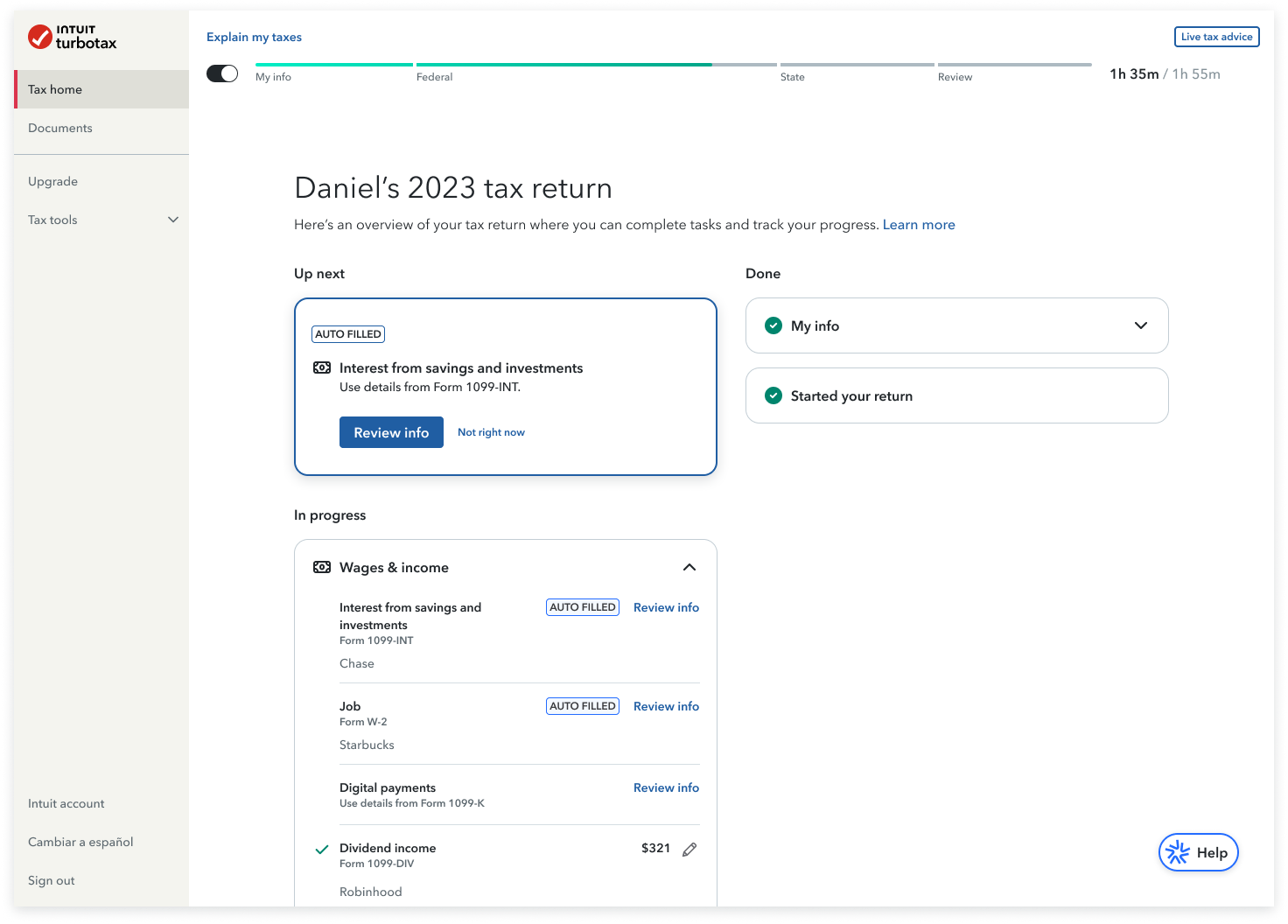
Autofilled + Review info CTA
Missing info CTA + Uploaded form
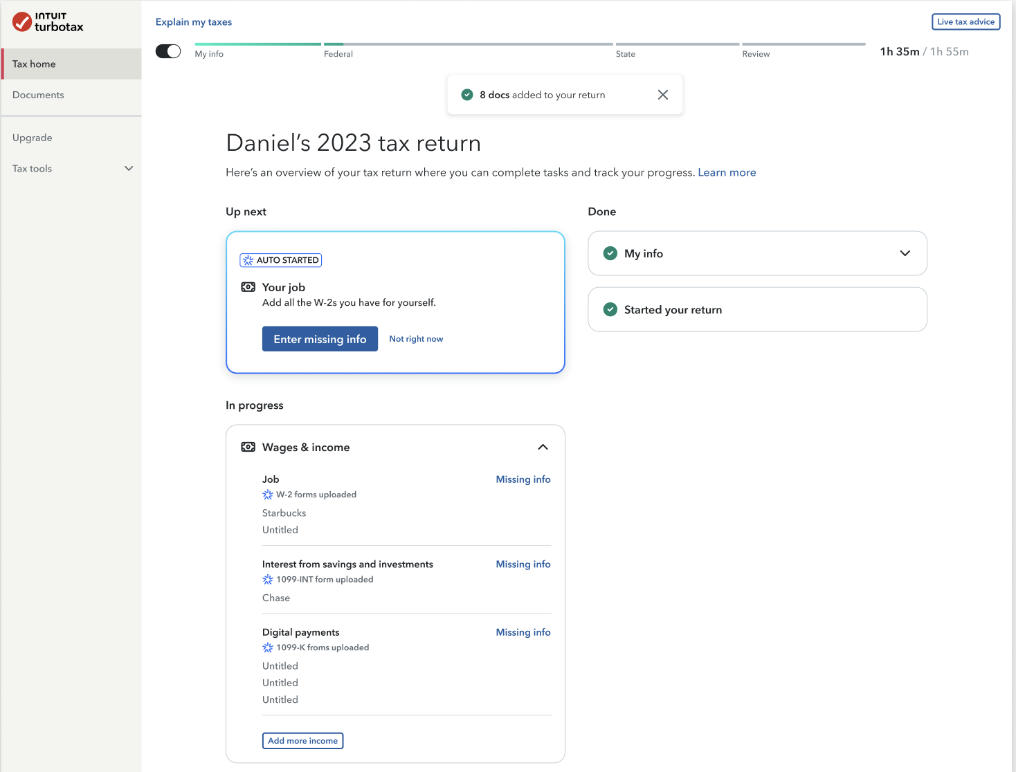
Auto complete, auto start, review, continue
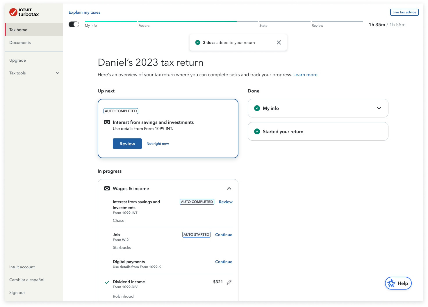
User testing showed us that users wanted an actionable CTA and preferred Missing info or Review info.
We also learned that users appreciated seeing which forms had been uploaded and understood what autofilled and autocomplete meant.
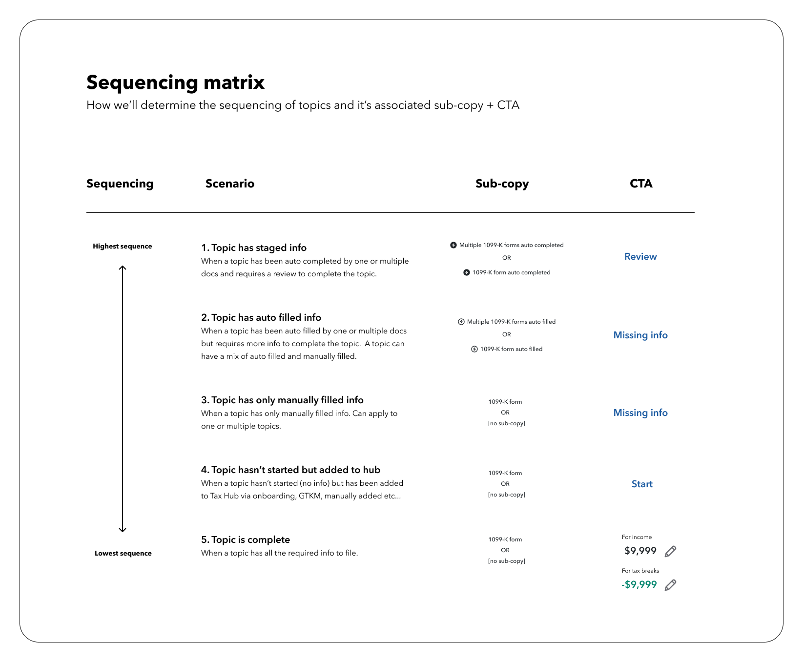
Content Strategy
Scenarios: subcopy + CTA
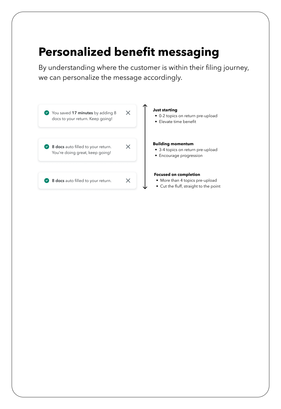
Additional messaging
Final design
User testing showed that users understood the CTAs, autofilled badging, and the content hierarchy. However, users felt the time benefit on top was unnecessary, leading us to save it for a later build. Overall, user satisfaction increased by 100%.