Turbotax
The Brief:
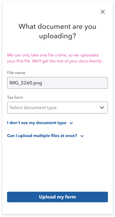
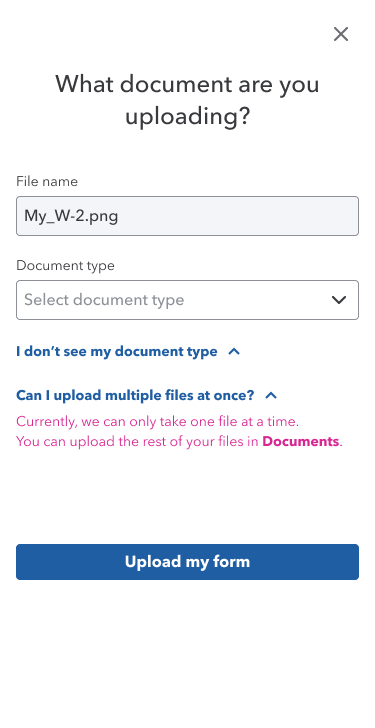
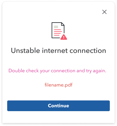
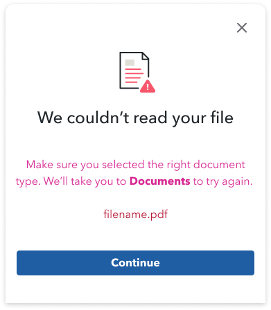
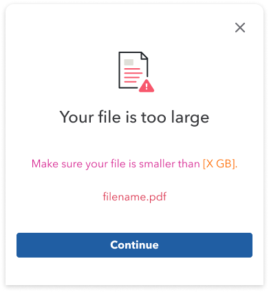
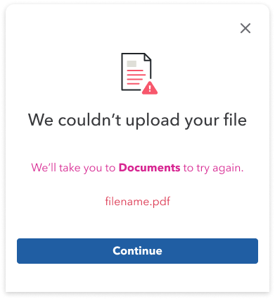
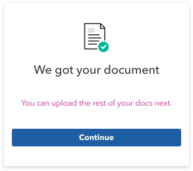
One of the projects I worked on at Turbotax revolved around crafting error messages when uploading forms.
Working closely with the product designer and manager, we successfully delivered all 7 error states within one week.
For this portfolio, I will be focusing on my design-thinking process for 1 of the 7 error messages I worked on.
Role:
Content designer
What I did:
User flow analysis
Content strategy
Content design
Error state #1
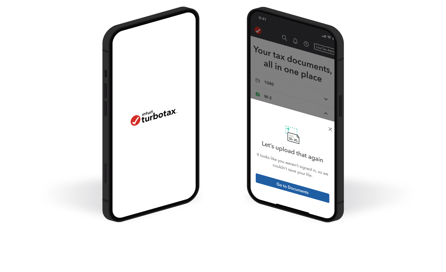
A user uploads a form but is not saved.
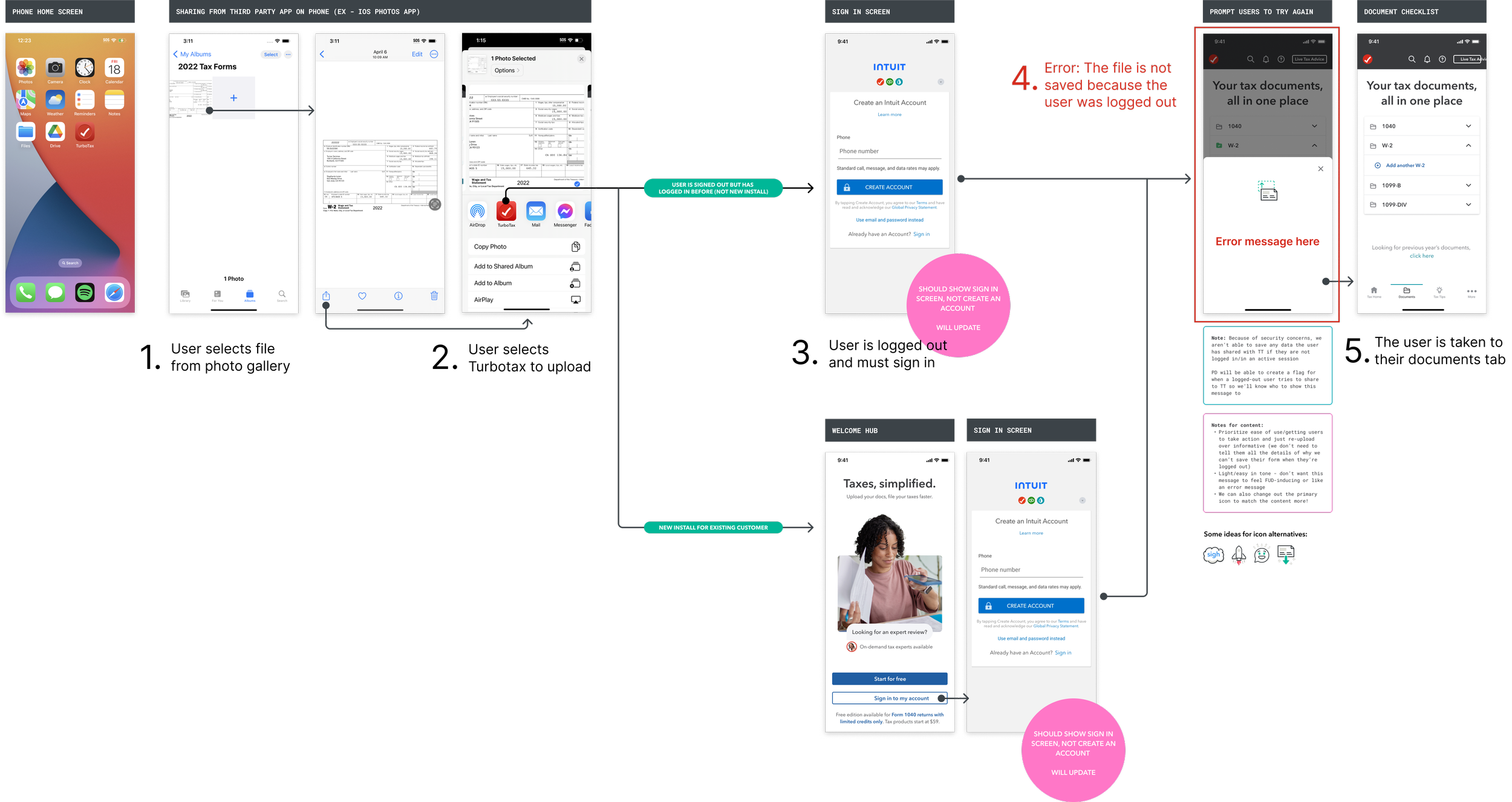
How might we:
Craft an error message that informs users that:
Their file was not uploaded because they were logged out
They must re-upload their file in their Documents tab
without making them feel uncertain or doubtful?
Looking for answers…
Who is the audience?
Mostly simple filers, a younger audience who uses Turbotax on mobile.
Explorations:
Headers
What is the voice & tone?
Conversational
Informative
Guiding
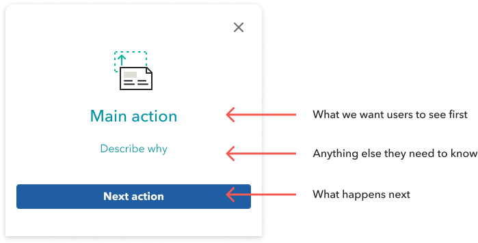
The breakdown of information hierarchy.

After experimenting with multiple copies, I chose variation C as it best aligned with the main action, using a conversational, informative, and guiding tone.
Subcopy
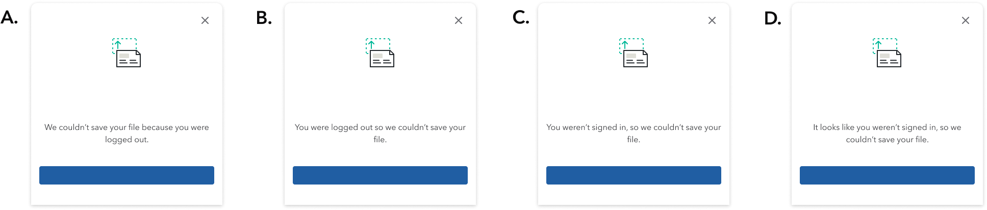
For the subcopy, I chose variation D as it gave the clearest explanation for the error in a direct but conversational tone.

CTAs:
For the CTA, I chose variation B as it was the most direct to what the next screen would be, as they would be taken to the Documents tab to upload again.
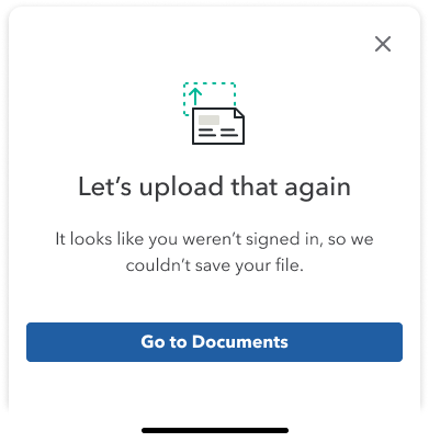
Final copy:
Header:
conversational, informative, guiding
Subtext:
explanatory, direct, conversational
CTA:
next screen, direct
What is the main purpose of the error message?
To let users know they must re-upload their form.
Content strategy:
Other error states I worked on: