Paven
The Brief:
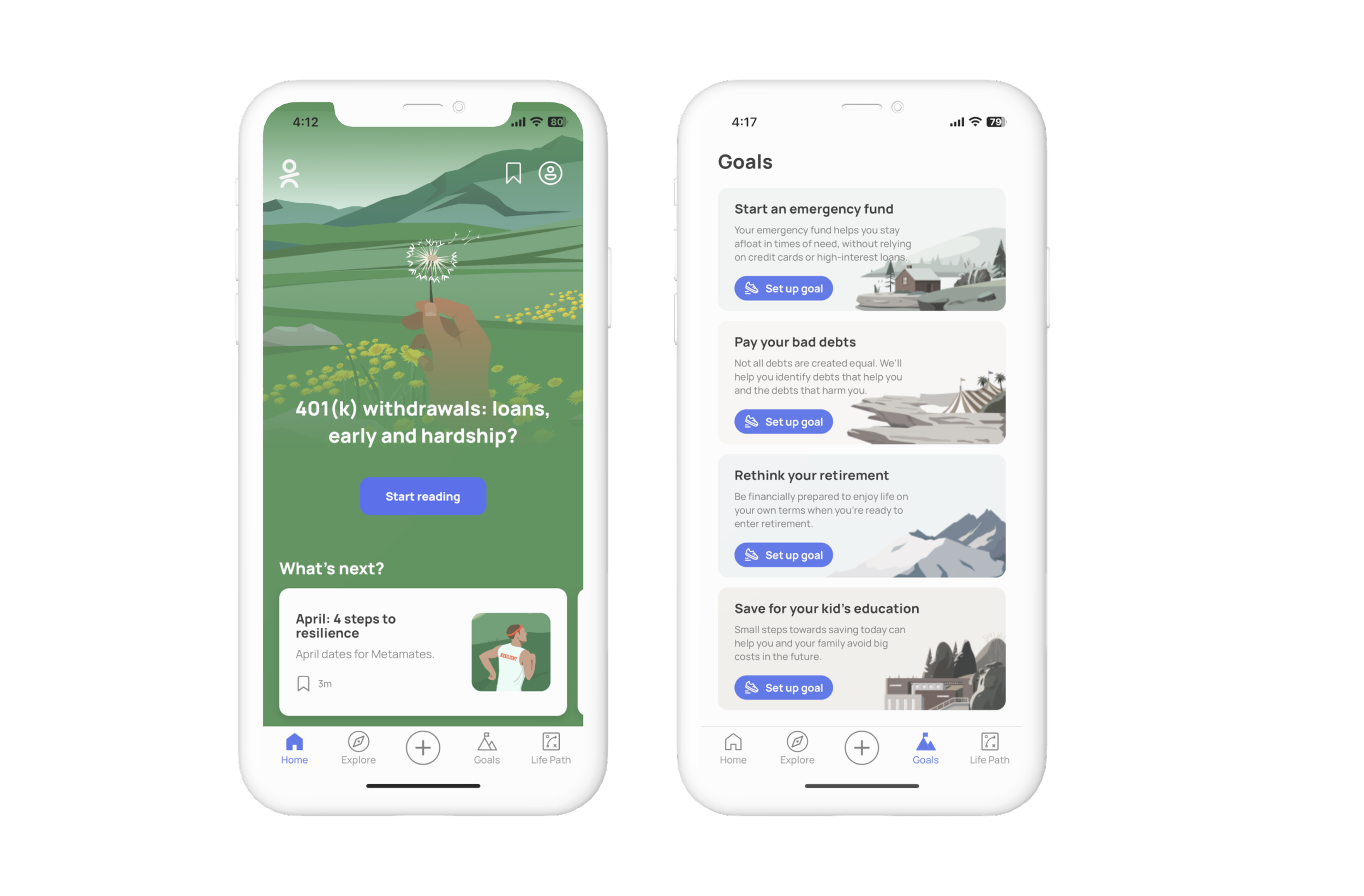
Paven, a financial wellness platform for Meta employees, was struggling to have their users complete their retirement goal set ups. To tackle this issue, I focused on revamping the onboarding screens to give users the confidence they need to finish setting up their goal.
Role:
Content designer
What I did:
Audit and redesign content
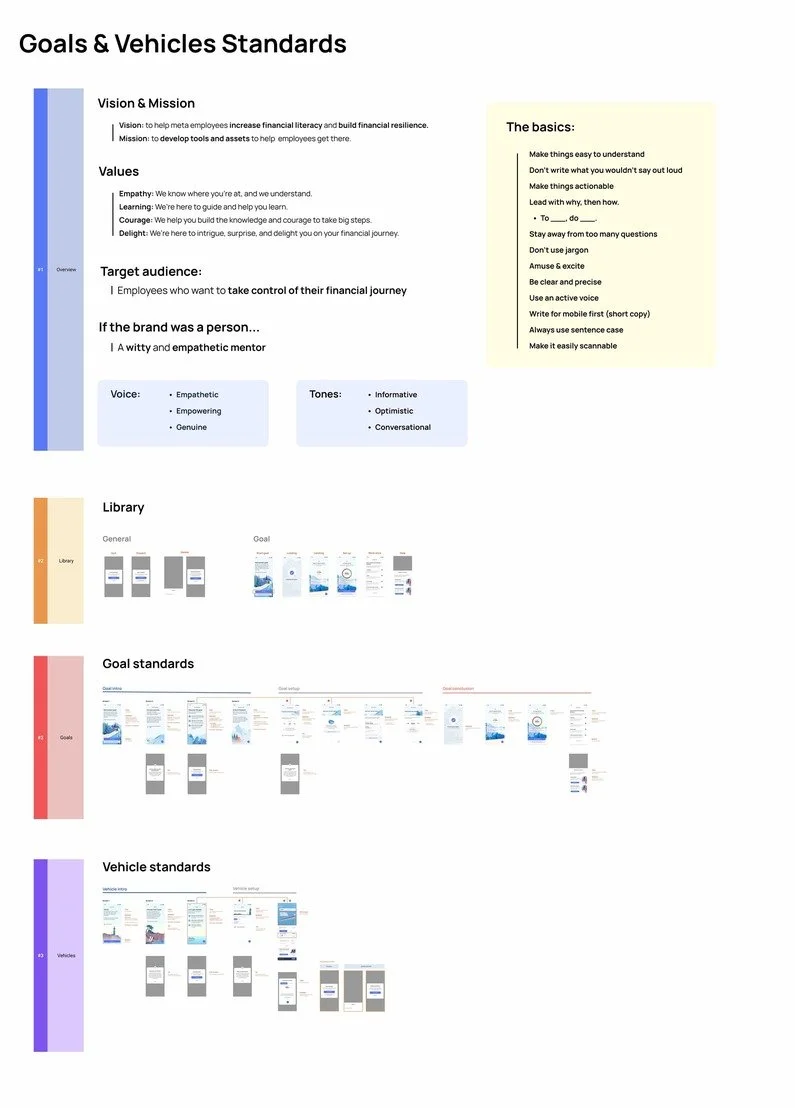
Develop voice & tone
Align consistency across products
Retirement Goal
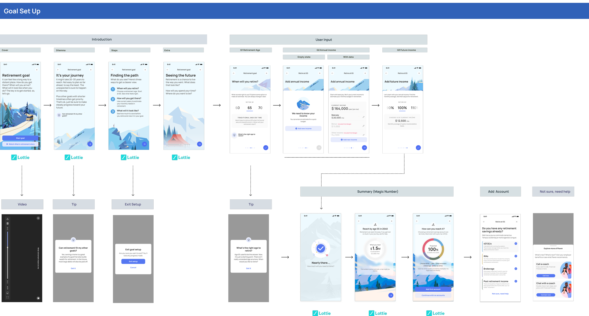
I was given the task to audit content on the retirement goal and find gaps to improve the product.
*In this case study, we’ll focus on the goal intro screens.
Initial Thoughts
While reviewing the flow, I had 4 main questions:
What is the goal?
Who is the main audience?
What is the voice & tone?
What is the user’s journey?
Define goal → Understand persona → Establish tone/voice → Map user journey → Audit → Draft & iterate → Test
Looking for answers…
It was important for me to understand the scope before diving into action.
Who is the audience?
Employees with low to medium financial literacy who are interested in setting up their retirement goal.
Potential feelings of fear, confusion, excitement.
What is the voice & tone?
Voice: If the brand was a person...
a witty but empathetic mentor
Tones: casual, supportive, real
What is the goal?
To encourage employees to set up their retirement goal and start taking steps towards financial freedom.
I also looked at the current flow to understand the user journey:

Define goal → Understand persona → Map user journey → Establish tone/voice → Audit → Draft & iterate → Send off
It’s time for an audit…
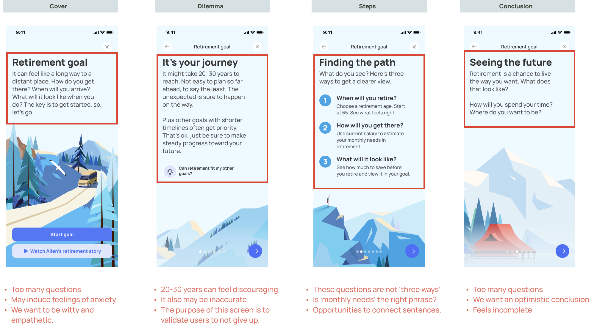
Retirement goal intro [4 screens]:
How might we:
Adapt a more empathetic tone so users don’t feel overwhelmed?
Reduce the number of questions to stay clear with our messaging?
Create a better story to encourage users to set up their goal?
Define goal → Understand persona → Map user journey → Establish tone/voice → Audit → Draft & iterate → Send off
Let’s draft!
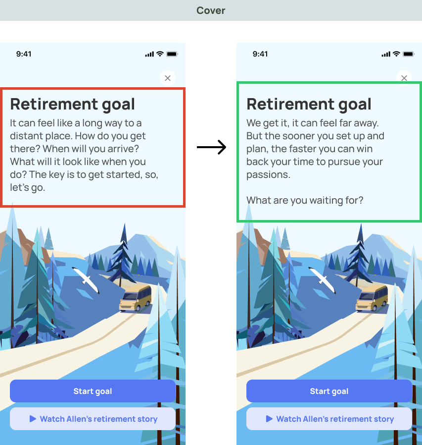
Before:
Reflects an anxious tone
Too many questions
No structure or storyline
After:
Empathetic & mentor-like tone
Usage of one open-ended question
Structured storyline
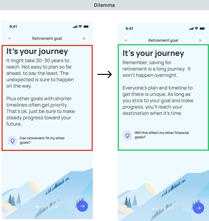
Before:
‘20-30’ years feels discouraging
Too focused on the negative
Overly informal tone
After:
Elimination of ‘20-30’ years
Content shift towards optimism
Mentor-like tone
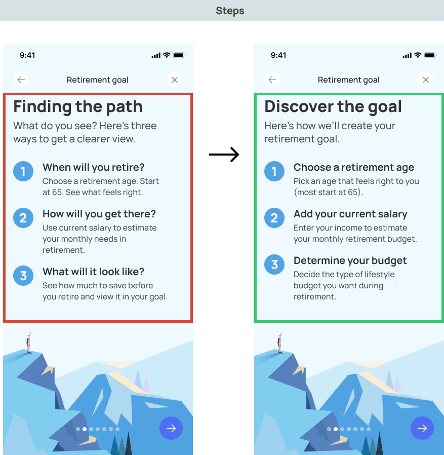
Before:
Inaccurate usage of ‘three ways’
Too many questions
Opportunities for simplicity and clarity
After:
Elimination of ‘three ways’
Replacement of questions with actions
Direct and clear information
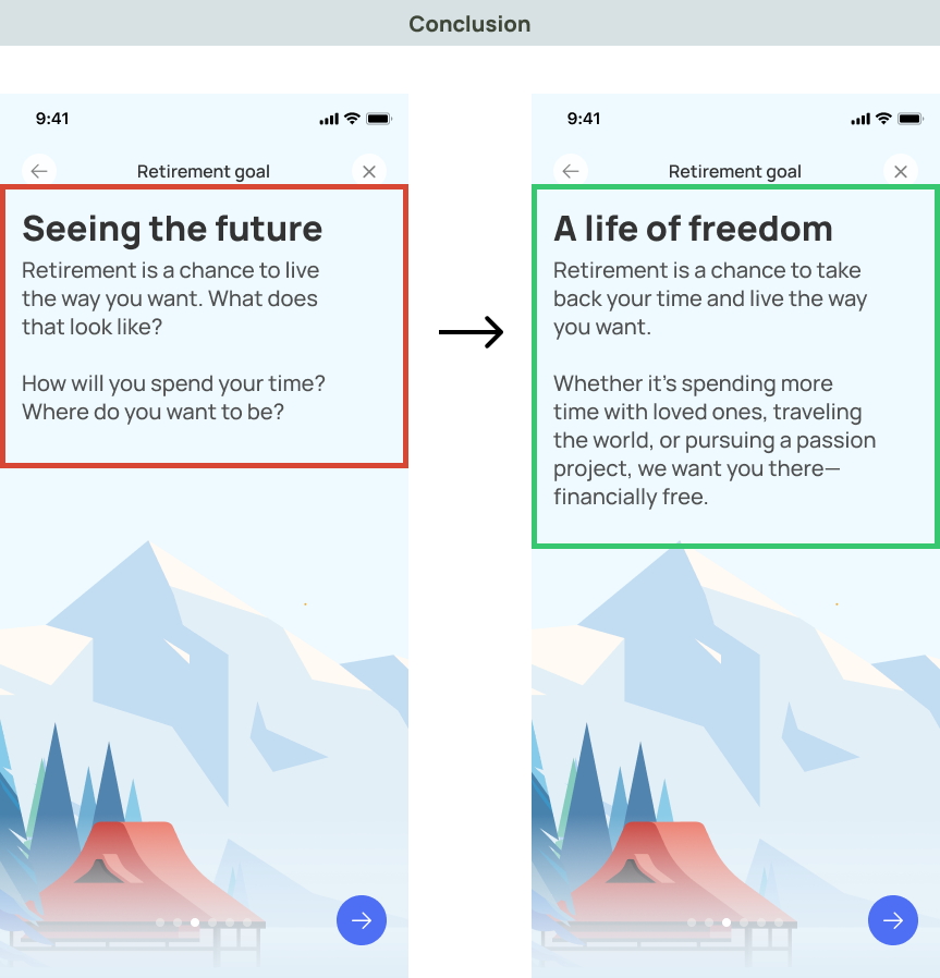
Before:
Incorrect tone
Opportunity for more assurance
Conclusion has no added value
After:
Mentor-like and witty tone
Content shift towards confidence
Added value of why they should set up
Define goal → Understand persona → Map user journey → Establish tone/voice → Audit → Draft & iterate → Send off
Send off 🚀
After finalizing drafts, I sent off the copy to our product designer whom replaced the copy on the product.
Changes in content increased readability to a 100%
100% of users agreed to higher satisfaction of goal set-up
Content standards
I also built out Paven’s content standards as a reference for future UX writers on the project.